Rasenball – The Implementation
Rasenball Implementation
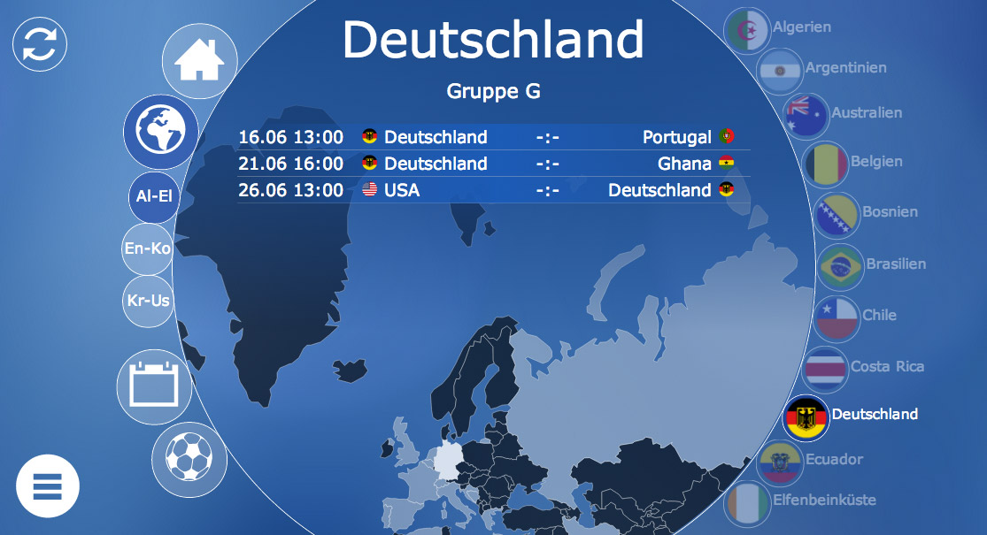
This article discusses the Rasenball visualization from a more technological point of view. A general overview over the application can be found in the previous article Rasenball – World Cup Visualization. The main technical obstacles were performance issues in the mobile version that led to a couple of design decisions. Using a flat design enabled us on the other hand to use a couple of state of the art design techniques to realize the application like Icon-Fonts and CSS effects where otherwise images might have been necessary.
Used Technology
D3.js
As basic JavaScript framework we chose D3.js over jQuery for its better support for data driven animations and its support for maps. Although the application is rather dynamic we did not make to much use of the transitioning functionality of D3.js as it turned out to be much slower than native CSS based transitions. So D3.js based JavaScript transitions were only used when no CSS alternative was available which was basically only for path expressions in SVGs as they cannot be controlled by CSS.
Icon Fonts
For single-colored icons we used icon fonts whereever possible. Using vector fonts as basis, these fonts can easily be scaled. Additionally an icon can easily be replaced by another using CSS only. For more information have a look at our article on Icon Fonts.
CSS-Transforms and -Transitions
For the animation sequences we made heavy use of CSS transform and transition properties which are available in most browsers excluding IE in versions before 10. CSS transforms are often hardware accelerated and thus much faster than animations using JavaScript. It is important to note that we used transform-operations instead of modifying height, width or top and left directly, as these operations are often much faster, because translation and scaling is done by capturing the current screen content and scaling it as if it was an image. While being much faster, this has a couple of negative consequences we will discuss in the next section. For more on tranform vs. absolute position see this article by Paul Irish.
Relative Sizes
Building a scalable web application introduces a couple of difficulties. It is no longer possible to use pixel-based positioning as different devices have different widths and heights. Instead we used relative positioning based on the screen size available. This can be done using em as the basic unit of measure. (Using rem would be even better as its purpose is to be defined once on the root element, but rem did not work on some mobile devices, so we used em instead.) Depending on the screen resolution we calculate a font-size on the body element. One em is corresponding to the font-size in pixels. If, for example we defined the font-size of the body as 10px, 10em would be 100px. We can thus divide our pixel-based positioning by 10 and use em.
In those cases where we actually need font-sizes different from the base font size, we can again specifiy them relatively either by percentage or by em-values. A font of 20px thus becomes 2em or 200%.
Interesting Challenges
CSS-Transform and -Transition
As mentioned above, we used CSS-Transform and -Transition to animate elements. This is much faster on mobile devices, particularly with non-opaque elements, than CSS-Transitions with positioning or JavaScript-based animations. It is important to note, however, that the browser clips the image of a rectangular area to make these transitions. For elements with rounded borders as in our application, the entire rectangle would suddenly be visible during the animation, although it should be clipped by the border radius. We delt with the situation by using an image to clip the content. We thus have multiple drawing layers on top of each other. The layer inside the circle is at the bottom, the area outside of it is on top and the actual navigation items or the top most layer. By disabling the different background-images with the Developer Tools, this can easily be seen.

SVG and HTML Alignment
Another architectual decision was to use HTML whenever possible. HTML has much better support for images and text. The challenge was thus to align both technologies. As mentioned above, this was accomplished by using relative sizes with ems and percents on the HTML and a viewBox on the SVG. The main SVG has a width depending on the available screen width. Once the screen is resized, the font-size value on the body element is recomputed and all HTML elements are rerendered in the same relation to the SVG.
SVGs: Pre-Rendering vs Rendering on Client
SVG obviously could have been prerendered on the server-side. This would, however, have resulted in larger documents and a layout that needs to be synchronized between client and server. Since we wanted to highlight elements on mouseover we needed to know their position so that most of the algorithms would have been on the client anyway. Tests showed that modern clients could easily manage rendering larger SVGs on the fly, so that we decided to render everything on the client.
Application Skinning
We heavily used CSS in favor of inline-styles or SVG-attributes. This has some advantages as the SVG can easily be styled using CSS-properties and can be animated using CSS-transitions. The main disadvantage is that a lot of SVG rasterizers cannot cope with external styles in SVG. Therefore a lot of server-side tools fail to render PNG- or JPG-files. Luckily we we already had a little Java-tool for inlining styles, so that we could use the same SVGs in Charts that got e-mailed during the game.
Client Specific Elements
Slightly annoying was the fact that apple has little support for fullscreen applications. Starting with iOS 7.1, however, one can declare minimal-ui as HTML-Meta-Tag resulting in less controls on the side in mobile Safari.


